
background-size: ;
0%{background-position:0% 50%}
50%{background-position:100% 50%}
100%{background-position:0% 50%}
}
0%{background-position:0% 50%}
50%{background-position:100% 50%}
100%{background-position:0% 50%}
}
0%{background-position:0% 50%}
50%{background-position:100% 50%}
100%{background-position:0% 50%}
}
0%{background-position:0% 50%}
50%{background-position:100% 50%}
100%{background-position:0% 50%}
}
CSS Gradient Animation Generator
Build an animated CSS gradient - choose colour stops, set the angle and animation speed, then copy the generated linear-gradient declaration plus @keyframes block straight into your stylesheet. Everything runs in the browser; no upload needed.
Choosing which vendor prefixes to keep on
The three vendor-prefix checkboxes on the input panel control which engine families appear in the generated snippet: keep WebKit on for Chrome, Edge, and Safari; Gecko on for Firefox (most of those rules are unprefixed in current builds, but the line is still useful as a fallback for older Firefox builds); Opera on only when a legacy Presto-era target is in scope. The output panel reacts to each toggle in place, so the snippet you copy contains only the prefix lines and per-prefix @keyframes blocks your target browsers actually need.
Gradient Angle and Scroll Angle do different jobs
Gradient Angle sets the direction the colour stops run in the CSS linear-gradient() declaration itself - the angle you tune for a static, non-animated gradient. Scroll Angle instead sets where the @keyframes block moves the background-position TO as the animation loops, so a gradient can point one way (say, left to right) while its animation drifts a different way. Scroll Angle only matters once the speed slider is put to use; leave it at its default for a static gradient.
Renaming the keyframes identifier before you copy
The keyframes identifier in the copied snippet is the string in the AnimationName field - rename it before clicking Copy and every @keyframes block, every -webkit-animation declaration, and every -moz-animation line in the output picks up the new name. That matters when the target stylesheet already carries another @keyframes block: two same-named animations collide, the most-recent declaration silently wins, and the gradient stops moving with nothing obvious to point at.
Once the snippet is in your stylesheet, drop it into the text / HTML editor first to watch it animate against your real markup before it touches the project. Then CSS Minifier compresses the stylesheet for production (gradient declarations included), and CSS Unminifier reverses that when a colleague hands you a one-line build and you need readable formatting to debug a missing semicolon. The rest of the format and hash steps sit on the developer tools hub.
How Add-colour and Reset work together
Add-colour stacks stops one at a time; the minimum of two stops is enforced - Preview won't fire until two are set. Each stop becomes one entry in the comma-separated colour list inside the linear-gradient() output, so a 5-stop gradient gives you five percentage positions. Practical smoothness flattens out around 10-16 stops on lower-tier hardware: beyond that, per-frame paint cost catches up with the animation-speed slider and the live preview drops frames on a 1-second loop that ran cleanly at 5 stops. Reset clears only the colour-stop container - it leaves the gradient angle and animation-speed slider unchanged, so you can erase a failed palette experiment back to the 2-stop default without re-entering the timing, and without a page reload.
What the generator outputs: linear-gradient CSS, not an image
The generator builds linear gradients only - not radial or conic ones - and it hands back CSS rather than a rendered image file, so there is no asset to host.
How to Use the CSS Gradient Animation Generator
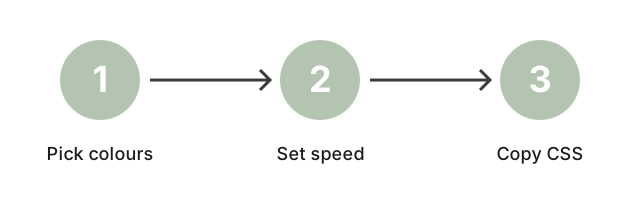
Using the CSS Gradient Animation Generator is straightforward. Follow these steps to create your custom animations:
- Open the Generator: Access the CSS gradient animation generator on any device with a browser.
- Set the Gradient Angle: Use the angle picker to set the direction of your linear gradient (this generator outputs linear-gradient CSS; radial and conic gradients are not supported).
- Customize Colors: Add, remove, or adjust color stops to set the transition colors.
- Define Animation Properties: Adjust settings like direction, duration, and iteration to control animation speed and style.
- Preview and Copy: View the live preview of your gradient, then copy the generated CSS code to paste into your project.
Benefits of Using Animated CSS Gradients
Adding animated CSS gradients to your website can enhance user experience and visual appeal. Here's why CSS gradient animations are a valuable addition:
- Modern Aesthetic: Animated gradients offer a trendy, eye-catching design element that keeps users engaged.
- Enhanced User Experience: Dynamic backgrounds and animations can make sites more interactive and appealing.
- Cross-Browser Functionality: CSS gradient animations are supported by most modern browsers, ensuring consistency for all visitors.
- Simple Customization: Easily adjust colors, direction, and speed to create unique animations without complex coding.
Frequently Asked Questions
What is a CSS gradient animation?
A CSS gradient animation is a visual effect where colors gradually change across a web element. Used for background animations and scrolling effects, gradient animations bring motion and depth to web pages, creating a lively design.
Can I use CSS gradient animations on all elements?
Yes, CSS gradient animations can be applied to various elements, including divs, buttons, and even text. Animating backgrounds and borders can enhance your design with smooth color transitions.
How can I ensure my gradient animations are cross-browser compatible?
To ensure compatibility, test animations in multiple browsers. You can use vendor prefixes like -webkit- and -moz- to improve support on older browsers.
How do I create a scrolling gradient animation in CSS?
Scrolling gradient animations can be created using the background-position property in CSS, combined with keyframe animations. Adjust the animation duration to control the scroll speed.
Why use an animated gradient generator?
An animated gradient generator simplifies the process of creating custom animations without coding. Preview and adjust settings visually, then copy the CSS code directly into your project.
Want a JSON formatter instead of a CSS gradient?
This generator produces an animated linear-gradient CSS snippet from colour stops, angle in degrees, and a speed slider - paste-ready output with per-prefix @keyframes blocks for WebKit, Gecko, and Opera. If the task you actually have is pretty-printing a JSON payload into an expandable tree, the routing destination on this site is https://freetoolonline.com/developer-tools/json-parser.html; it accepts JSON object or array text on input and renders the validate-and-format-tree workflow a JSON-formatter page is built for. The two pages are siblings in the developer-tools section, but the gradient generator consumes colour-stop + angle + speed parameters and the JSON parser consumes a JSON payload, so the input you have on the clipboard determines which page to open.
Conclusion: Enhance Your Website with CSS Gradient Animations
CSS gradient animations are an excellent way to add depth and motion to web designs. This online CSS Gradient Animation Generator makes it easy to create custom animations that bring vibrancy to your site. Experiment with different color combinations, speeds, and directions to craft the perfect animated background for your web pages.
to elevate your designs with dynamic, animated gradients.